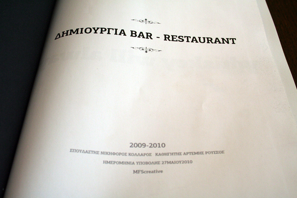
King Henry
the true whiskey stories
the true whiskey stories
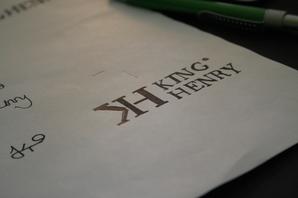
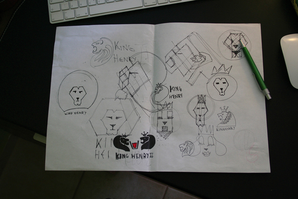
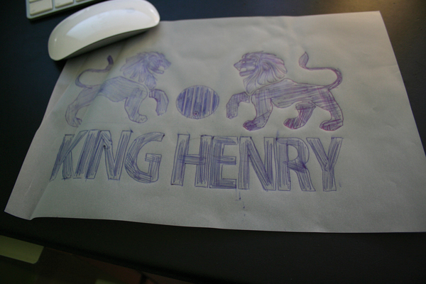
Through the creative procedure of the branding of the specific bar-restaurant, the hardest thing was the one that I had to decide the way that the logo should be, because the logo is the only thing that has to be on all the applications but without making brainwash to the viewer. The goal is to make people understand that the one thing they see at a time is part of the of a strange lifestyle experience and not individual elements that bomb them with a logo, but of course every single application must stand alone as with all the others.
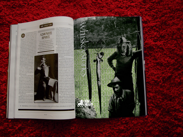
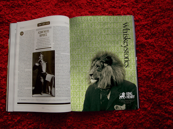
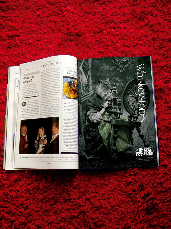
As the time goes by I had to made some choices like the color, and the style my bar-restaurant wanted to be. I've decided that I would like to experiment with elements from the historical period of 1930-1940 a.C. I also chose to make the branding process for a bar-restaurant that it's totally obligated to whiskey.
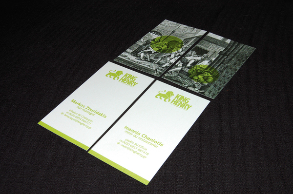
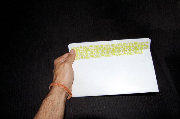
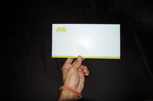
After that I had to decide the color of the logo. I have chosen a bright green. The reason is because the green color represents the nature, the new begging, life and many more virtues that my bar-restaurant should have. Also the bright green came in a twist the the heraldry logo I have designed.
Finally I wanted to pass a kinky aesthetic to the hole philosophy of the bar-restaurant.
Fonts Used (www.parachute.gr)
PF Clarendon
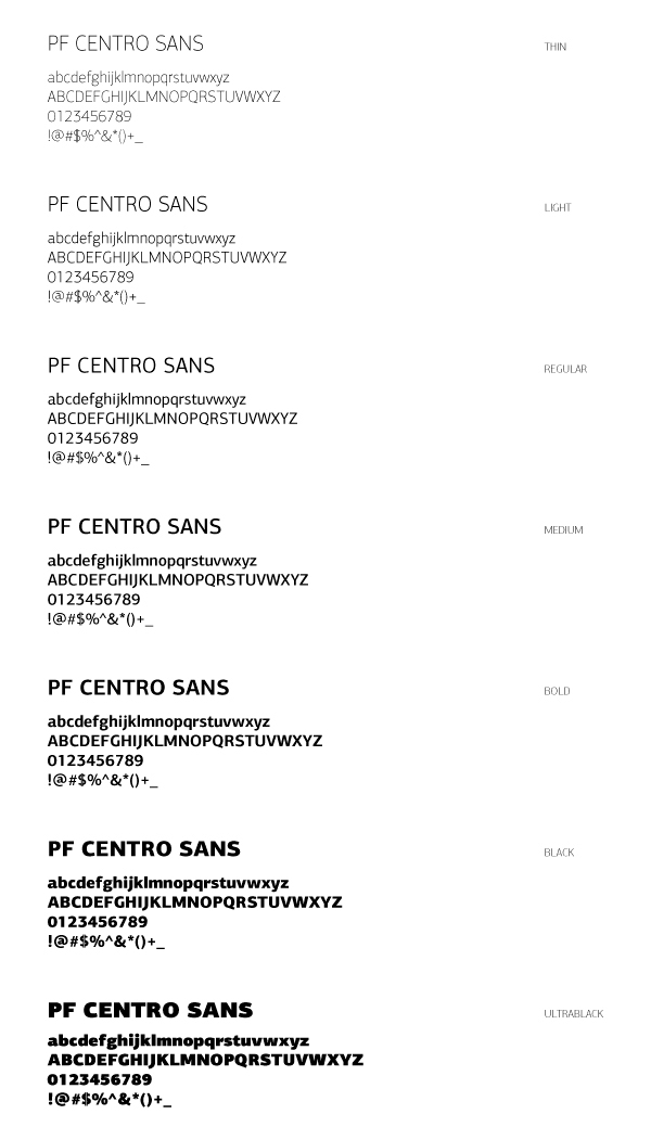
PF Centro
PF Encore
PF Garamond
As the time goes by I had to made some choices like the color, and the style my bar-restaurant wanted to be. I've decided that I would like to experiment with elements from the historical period of 1930-1940 a.C. I also chose to make the branding process for a bar-restaurant that it's totally obligated to whiskey.
After that I had to decide the color of the logo. I have chosen a bright green. The reason is because the green color represents the nature, the new begging, life and many more virtues that my bar-restaurant should have. Also the bright green came in a twist the the heraldry logo I have designed.
Finally I wanted to pass a kinky aesthetic to the hole philosophy of the bar-restaurant.
Fonts Used (www.parachute.gr)
PF Clarendon
PF Centro
PF Encore
PF Garamond
draft

final logo

colour

primary typeface

business cards

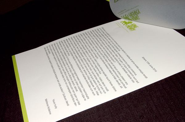
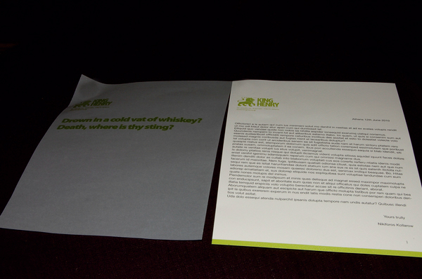
letterhead
Envelope 11cm*23cm
Envelope 23cm*33cm


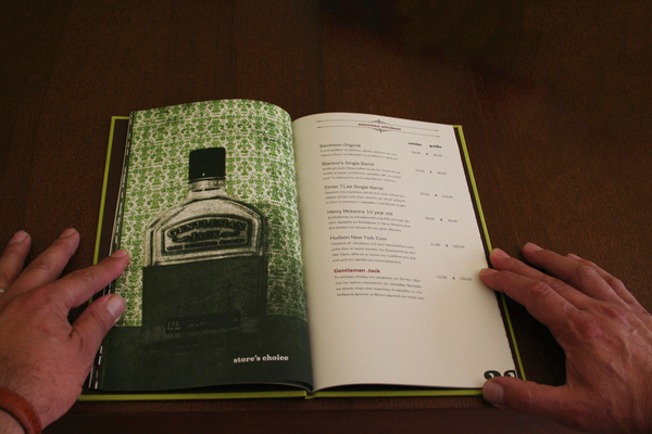
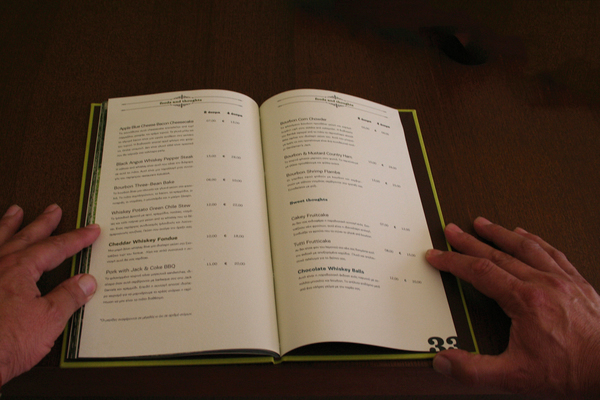
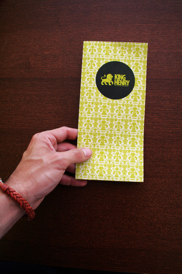
bar-restaurant menu


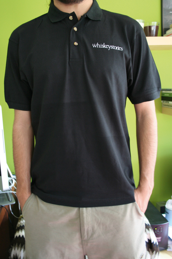
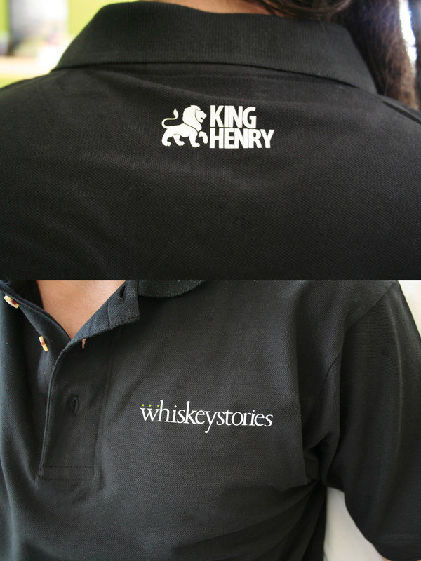
Employees clothes

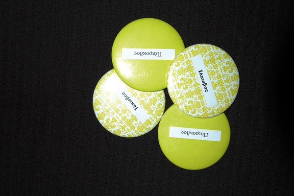
Employees badges
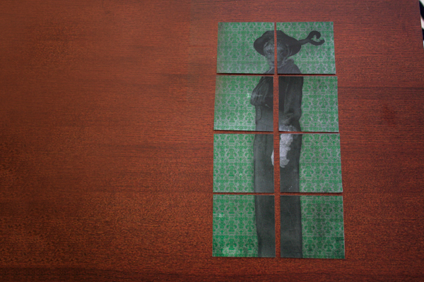
Suver
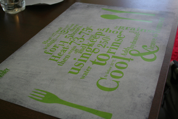
Supla
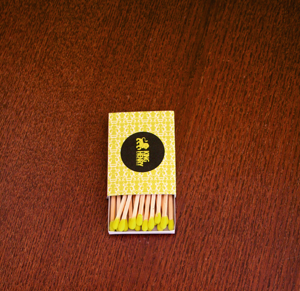
Matches
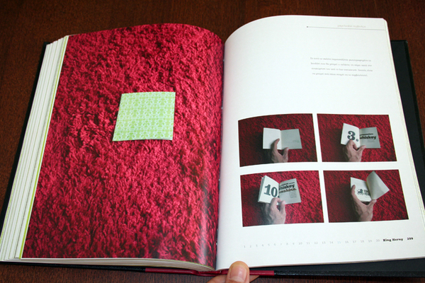
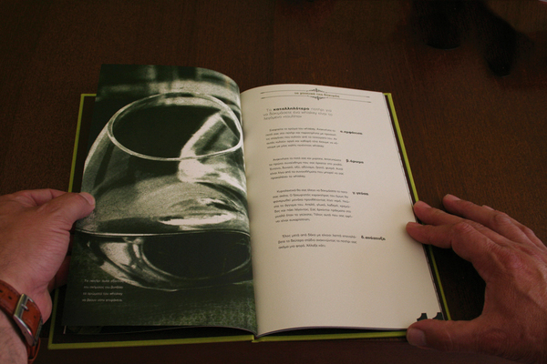
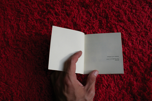
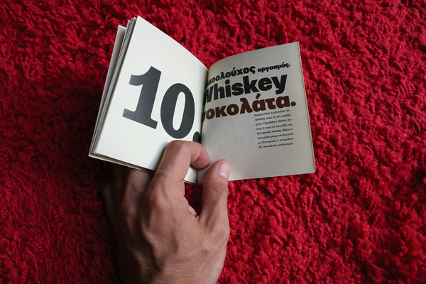
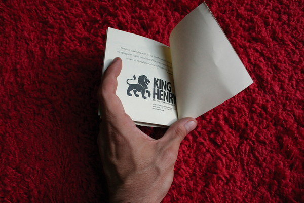
Booklet (the ten commandments)


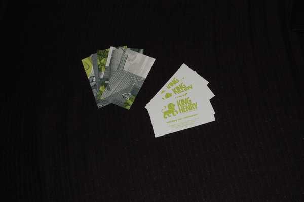
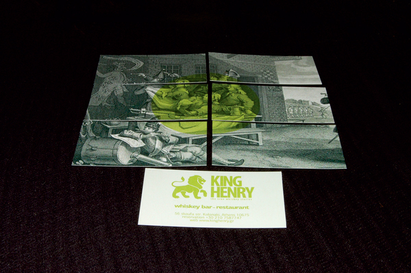
Bar-Restaurant cards
Receipt case

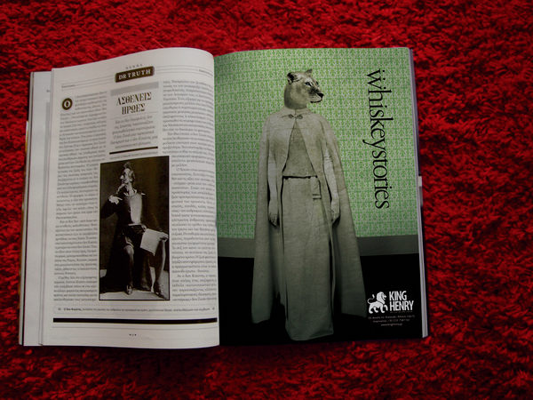
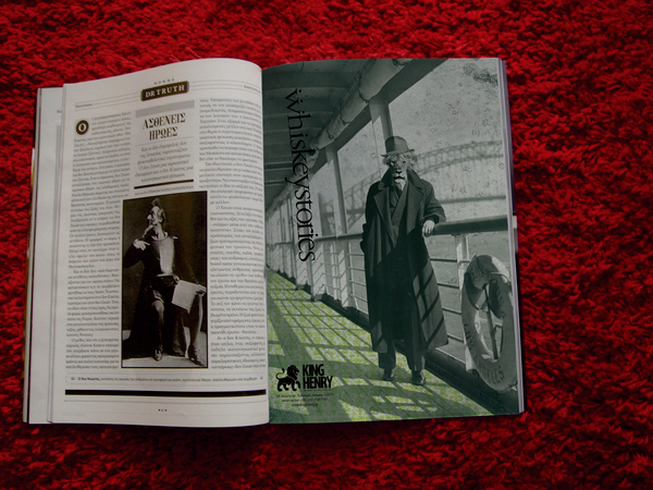
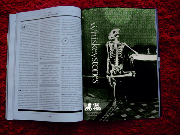
Magazine ads
Event posters

Website
iPad application

Flash banner